Think of me as a guide, not a guru. I help creative teams untangle messy ideas, align around what matters, and design systems that feel as good to use as they do to build.
Whether you’re launching something brand new or reworking a product that’s grown unwieldy, I join your team like a strategic co-op partner—spotting friction, asking the right questions, and helping everyone move forward with more clarity, confidence, and momentum.
Some people call it usability. Others call it flow, or product thinking.
I call it helping your work click into place.
From the early chaos of “what are we even making?” to the finer tuning of “why aren’t people converting?”—I help teams shape experiences that resonate, scale, and actually make sense.
Because when the system works, the team works.
And when the team works, you make money.
Left is BEFORE and right is AFTER. But it was the first time the design team was able to change the culture. (No small task) We brought design thinking and multi-team support to the front lines and produced something we were proud of, on a deadline of course.
I lead all user testing and research, design sessions, speed sketching, and stake holder communications, design review and design to development maintenance.
Getting care is the most important function of iTriage. How does a user know a green check is good or red X is bad? I still don't know what they mean. So, we re-categorized care options so a user can understand what's best and compare costs.
Clicking back and forth to read important medical content is not optimal. So with a simple scrolling card view, a user stays within the medical context while the Find Care option sticks to the top - this way, when a user believe this may be the condition worth checking out, they can find a provider at any time and get care.
Bust lists are hard to read. And users, sometimes, need to make a decision quickly. We added a map and simplified list items making it easy to understand the best choice compared to where the user is on the map.
Not only does scrolling through hundreds of results, a user doesn't know what they are looking at or for. Grouping results by medical types make it easy to understand which is most relevant.
At first there were too many options to a user and user was hidden at the top. We simplified a user's options from 7 options to 2 - both of which are our core compitencies.
I love big web. We needed a user to understand there were two very distinct functions of the site and they were just 1 click away from either.
We needed a big map and a long view for lists. We looked at Yelp, Zillow, Google, etc. We still don't have it all right. But this map makes finding a doctor much easier than no map at all.
Now, it's easy to see each care option, separated, and distinct.
No more back and forth to investigate what medical condition one may have. Almost a tab view, we gave the user access to everything without showing them everything.
The 5 Star app I designed for a good cause.
I was tasked to solve a very personal problem.
When taking care of a loved one, how can I still feel loved, needed, valuable, strong, encouraged, and less stressed?
I turned Care Management into a social app that encouraged the team of friends/family to support one another.
I gamified the experience.
Task 1: Learn about the users (Cie had conducted beautiful interviews with real care givers)
Task 2: Go off and learn and design on my own. Don’t just look at health or medical apps - look at goal or habit forming apps, learning apps, apps that make people feel good about any work they do.
Task 3: Facilitate team white boarding sessions
Task 4: Deliver 5 different designs for onboarding, homepage set up, and “social kindness” features to help users feel good about this very daunting task of caring for a sick loved one.
I had 20 hours of contract time. I did it in 18.
This is only part of the onboarding, but when we start with something as simple as your name - the immediacy of a personal feel is obvious. Stress is reduced before you even start.
I love using design I love.
The cards are essentially previews of richer content once clicked. Fuller screen card overlay is used to keep a user in context. Even removing navigation so accidental taps won’t confuse a user.
This design was to reduce navigation.
When users are coming to an app from stressful and anxious situation, figuring where to go is no fun. Card stacks keeps all information into categories that reduce clutter by placing all common items under a category.
This design is visual and contextual.
All items have visual icons to make glancing easy, “what is this?”
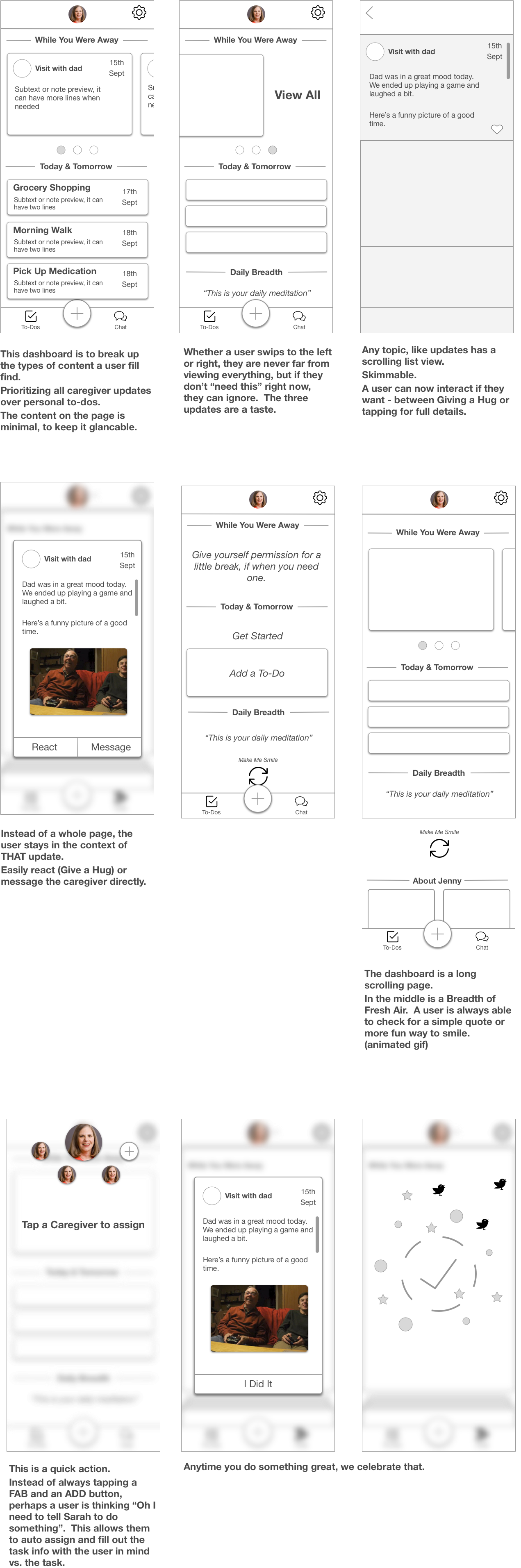
The user should never have to leave the Dashboard.
Swipe once or tap once and they are back to square 1.
Glancing is all about making a decision on “what to look at today”.
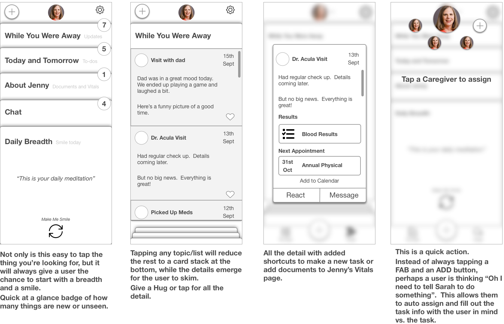
Instead of showing details all the time, we give you a count. If high count is important, the user taps it. If they only care about a topic they can see if it’s got anything worth looking at without having to po-go stick back and forth.
Whole app is 2 taps of depth.
Care management - care giving is honorable and difficult. Sometimes it’s a child caring for a parent. Other times it’s several people looking after one person.
Small birds fly on screen whenever another user is logged on. Tap and say hi.
Breath for small moments of stress relief….a reminder.
Celebrate every time you complete a task.
Give the user something to do when they need to vent - or a nice surprise on a refresh.
Show everyone how much you love them - tap a heart and the user will see it.
Onboarding shouldn’t be work. I need to show these already-stressed users that this app is friendly and taking care fo them.
While stressed, caring for a loved one, many times you are on your own.
I wanted to give a digital hug.
From home, the user can either hug another person (see the cute bird?) or see a message instantly when another teammate says, “Great job!”.
This shouldn’t look like work and the user shouldn’t have to remember why they opened the app.
The top card presents them with a message from a teammate for encouragement.
The cards at the bottom are actually modal windows (notice there is no need for navigation) that are contextual based on the task.
FYI - that little bird flutters on screen when a teammate is also logged in the app - you can say, “HI!”
I learned that many times 1 person really leads the care team, so the shared calendar needs to show tasks and people responsible.
Then with a simple segmented controller, the user can see their tasks only.
So they can organize their team or only worry about themselves. I didn’t want them having to search a whole calendar to find their own tasks. They are already stressed!
Becoming a care giver can happen, suddenly. Most of the time I learned, people are learning as they go. Can you imagine how scary that is?
I wanted to connect a user directly to a coach service. These can come from their insurance or a care coach network.
The business was concern how much more work this feature adds to developer costs, but the feature was too important to skip.